




Google Wallet and Apple Wallet Bring More New Features
New features transform the appearance and functionality of digital cards and pave the way for more frequent customer interaction
-
 17. 9. 2026
-
 7 minutes to read
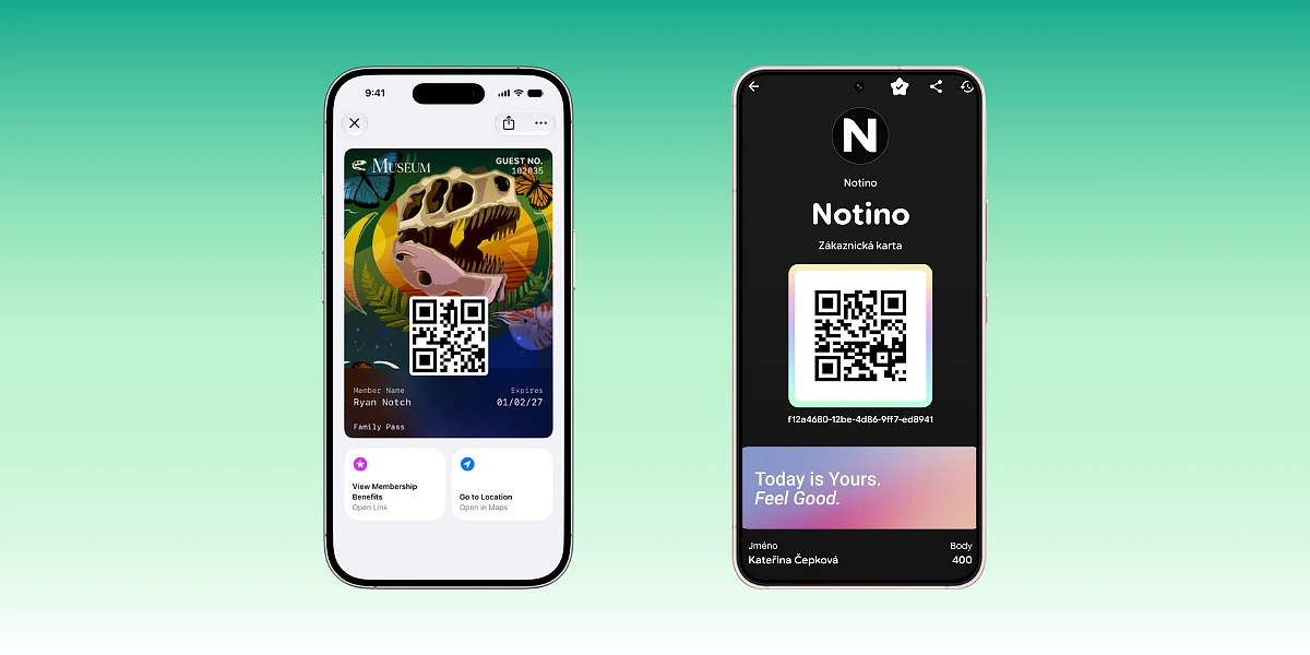
In June, we introduced you to the redesign of the Google Wallet main screen. Google changed how users see saved cards: instead of a long list, it introduced a compact two-column display and the option to mark favorite cards.
But the development of Google Wallet doesn't end there. Throughout 2026, Google continues to refine the card display and expand user interaction options. Meanwhile, Apple, with iOS 27, is introducing a new visual style called Poster Generic to Apple Wallet, along with new barcode formats and Featured Actions that allow quick actions to be displayed directly on the card.
For brands, this means that mobile wallets are gradually shifting from being mere storage for digital cards to environments where customers can actively use cards and navigate to other brand services and information.
What's New in Apple Wallet and Google Wallet?
The biggest changes this year concern the appearance of digital cards, their interactivity, and how users access them.
Apple Wallet
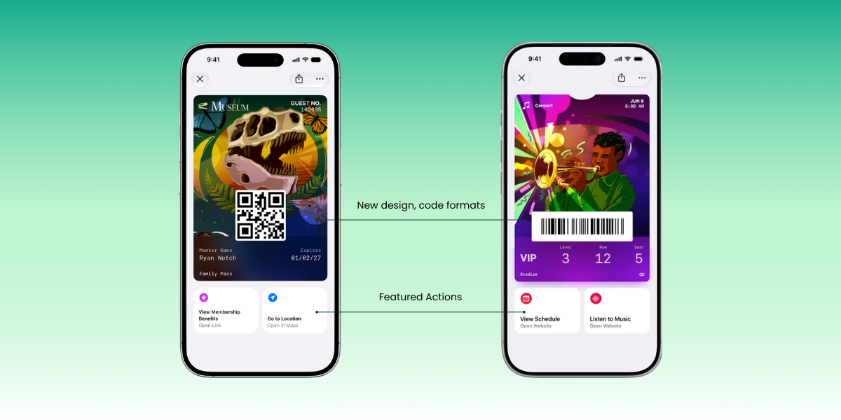
- New Poster Generic format: Digital cards can utilize a prominent full-screen image background, gaining more visual space for the brand.
- Featured Actions: Quick actions are displayed directly below the card and can lead users to more information or services.
- More supported barcodes: Apple has added support for EAN-13, Code 39, Codabar, and ITF formats.
Google Wallet
- New card display: Google has transitioned to a more compact grid view and allows users to mark favorite cards for quick access.
- More prominent pass appearance: The new display utilizes more space for brand colors and hero images.
- More features directly on the card: Action modules can direct users to websites, customer support, or information about locations, for example.
- Search: Users can more easily find specific cards or other items stored in Google Wallet.
The common trend is a greater emphasis on the visual appearance of cards, quick access to relevant functions, and the ability to use a digital card as a direct contact between a brand and a customer.
Apple Wallet Brings New Card Appearance and Features
One of the main innovations in iOS 27 is the new Poster Generic format. It is intended for loyalty and membership cards, gift cards, or other types of digital cards where a strong visual brand presentation is important.
Instead of the classic layout, Apple allows the use of a large image as the dominant card background. The logo, text fields, and possibly a barcode or QR code are displayed over it. The card thus gains a more prominent visual appearance directly in Apple Wallet.
For loyalty and membership programs, this means more space for brand visual identity. A digital card is no longer just a carrier of identification data or a barcode, but can also function as a prominent brand element in the mobile wallet.
Featured Actions Add More Functionality to Cards
In iOS 27, Apple is extending Featured Actions to all types of cards in Apple Wallet, including loyalty, membership, and gift cards. Quick actions are displayed directly below the card and can lead to a website, rewards, navigation, or other services.
Each card can contain up to two Featured Actions. Thus, a digital card can serve not only for customer identification but can also directly lead them to another action.
New Options for Barcodes
iOS 27 adds support for four new barcode formats: EAN-13, Code 39, Codabar, and ITF. This makes it easier for businesses to use digital cards with existing scanners and systems.
Google Wallet Changes More Than Just the Home Screen
The first major change in Google Wallet arrived in the spring. The main screen transitioned to a grid display with two items side-by-side. Users can select cards and other items they want on the main screen using a star. Others remain accessible through an expanded overview and search, where information about transactions of linked payment cards in Google Pay is also available.
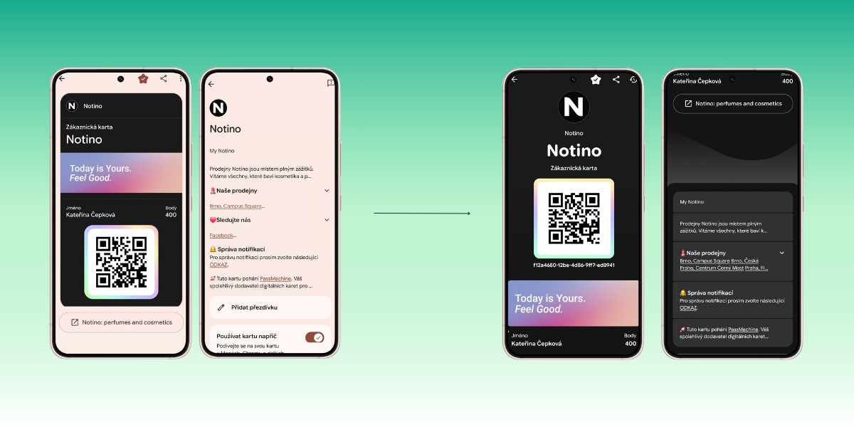
In the latest update, the appearance of the card detail itself has also changed. Google now offers two display options. The classic card view remains available via a button in the top right corner. However, the card is now primarily displayed as a single-sided view with a greater emphasis on visual brand presentation.
The hero image spans the full width of the card and scrolls below the identifier. Additional content is available directly below the main visual, so the user doesn't have to flip the card to access more information. They just need to continue scrolling. In one place, they can find links, brand information, or a link to download the app, if available.
For publishers, this means that the graphic assets of a digital card are becoming increasingly important in the Google Wallet environment. The logo, brand colors, and hero image are not just accessories but directly influence the card's appearance on the phone.
Google Wallet also supports links to websites, information about locations, or customer support contacts through modules directly on the card.
What Do Google Wallet and Apple Wallet Have in Common?
Looking at this year's changes on both platforms, several common directions are evident.
More Space for the Brand
Both Google and Apple are giving digital cards more space for visual content. Google is working with a more prominent hero image and a new card detail display, while Apple is adding the Poster Generic format with a full-screen image background.
More Features Directly on the Card
A digital card no longer needs to serve only for customer identification or displaying a QR code. Both platforms are expanding the possibilities of navigating from the card to a website, obtaining more information, contacting the brand, or using a related service.
Easier Access to Relevant Content
Google is working with favorite items, search, and location-based features. The goal is to get the relevant card or information to the user when they need it.
Greater Importance of a Well-Prepared Digital Card
With the new possibilities, not only the data contained in the card but also its visual design, information structure, links, and other functions are becoming more important. A digital card is now part of customer communication, not just a digital replacement for a plastic card.
Both companies have also linked loyalty programs to the moment of contactless payment.
What Does This Mean for Brands?
The development of Google Wallet and Apple Wallet shows that digital cards are gaining more space and functionality in mobile wallets.
When designing them, it's no longer enough to consider only how the card looks when saved. It's also important what the customer sees after opening it, what information will be available, and what further action they can take directly from the card.
For a loyalty program, this could be access to current rewards or benefits. For a membership card, a link to the membership account. For an event card, information about the program, navigation to the venue, or other organizational details.
The digital card is moving from a static identification element a step further towards a practical brand communication channel. And this year's changes in Google Wallet and Apple Wallet further support this development.